
Optimizing your website’s images is one of the most effective ways to speed up page load times and improve user experience. Images often make up a large portion of a webpage’s total weight – around 50% of the page’s file size on average. This means unoptimized pictures can significantly slow down your site. And speed matters: over 50% of users will leave a site that takes more than 3 seconds to load. Slow-loading photos can even hurt your SEO by affecting Core Web Vitals (like Largest Contentful Paint) and overall site performance.
The good news is that you can have both a visually rich site and fast load times by following best practices for image optimization. Below are 12 proven tips to help you enhance load time and UX through smarter image handling.
Table of Contents
1. Choose the Right Image File Format (JPEG, PNG, WebP, etc.)
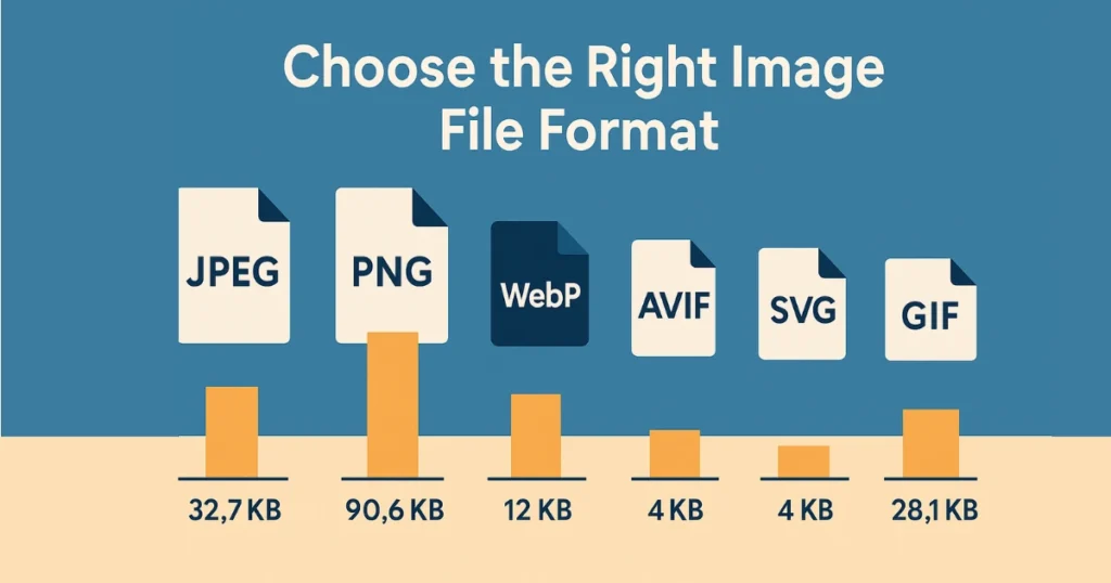
The same image saved in different formats can vary greatly in file size. In the example above, a photo was 90.6 KB as a PNG (lossless) versus 32.7 KB as a JPEG, and modern formats WebP/AVIF reduced it to around 12 KB with little quality loss. Choosing the optimal format can drastically cut file size without visibly impacting image quality.
Not all image file formats are created equal. Each format has strengths and trade-offs, so picking the right format for each image is key. Using the wrong format can needlessly bloat your page. For example, photographs should typically be saved as JPEGs rather than PNGs – a photo saved as a PNG can be multiple times larger than the same image as a JPEG. On the other hand, graphics with flat colors or transparency (like logos or icons) are best as PNG or SVG files for clarity without compression artifacts. Here’s a quick format guide:
- JPEG (JPG) – Best for photos and complex visuals. JPEG uses lossy compression to significantly reduce file size, with a slight quality trade-off. A well-compressed JPEG keeps image quality high while cutting down bytes.
- PNG – Best for simple graphics, logos, or any image that needs transparency. PNG is lossless, preserving exact quality, but results in larger files for detailed images. Use PNGs sparingly for photographs (they’ll be much larger than JPEGs).
- WebP – A modern format that often produces smaller files than JPEG or PNG for equivalent quality. WebP supports both lossy and lossless compression and is widely supported in browsers. It’s a great default choice if your site and users’ browsers support it.
- AVIF – A cutting-edge format with even better compression than WebP, meaning file sizes can be smallest for a given quality. AVIF is lossy or lossless and supports transparency. Browser support is growing (not yet universal), but it can yield impressive size reductions.
- SVG – A vector format (not pixel-based) ideal for icons, logos, and illustrations. SVG images are text-based instructions (XML) for drawing shapes, so they scale to any resolution without losing quality and are often extremely small in file size for simple graphics.
- GIF – Only use for very small or simple animations. GIF is limited to 256 colors and old compression, so it’s not efficient for photographic images. For animations, consider newer alternatives (like animated WebP or even short videos) for better compression.
In short, match the format to the content of the image. A good rule of thumb is JPEG for photos, PNG or SVG for graphics, and WebP/AVIF for optimal compression. Choosing the right format will ensure you’re not wasting bytes and your images load faster without sacrificing clarity.

2. Compress Images Without Losing Quality
After choosing an appropriate format, the next step is to compress images to reduce file size as much as possible while maintaining acceptable image quality. Image compression removes or consolidates data in the file so that it downloads faster. There are two main types of compression:
- Lossless compression – Reduces file size without removing any visual data. It works by finding more efficient ways to store the same information (for example, compressing repeating patterns). The image looks identical before and after. Formats like PNG use lossless compression.
- Lossy compression – Achieves much smaller file sizes by permanently discarding some image data (usually details the human eye is less likely to notice). This can slightly reduce image quality if overdone, but when tuned well the difference is nearly imperceptible. JPEG, WebP, and AVIF support lossy compression.
In practice, you’ll often use lossy compression for big savings. The key is to find the sweet spot between file size and image quality. Many tools allow you to adjust quality settings – for example, saving a JPEG at 80% quality can cut the file size dramatically while still looking crisp. Always preview the result to ensure the quality is acceptable.
There are numerous ways to compress images:
- Export from image editors for web – Most image editors (Photoshop, etc.) have a “Save for Web” or export option where you can adjust quality and remove metadata. Use these to shrink your files when saving images.
- Online compressors – Tools like TinyPNG, JPEGmini, or Squoosh can automatically compress images. You upload your image and get a smaller version back. For instance, TinyPNG uses smart lossy compression to reduce PNG or JPEG file size often by 50-80% with negligible loss in quality.
- Build process or plugins – If you manage a lot of images (like in a large website or CMS), consider automation. There are plugins and scripts (for example, webpack image minifiers or WordPress plugins) that will compress images in bulk for you. This ensures every image on your site is optimized without manual effort.
By compressing your images, you reduce the bandwidth and storage requirements for each image, which directly translates to faster load times. Users on slower connections or mobile data will especially appreciate the smaller files. Always remember: the goal is to minimize file size while preserving visual quality. A well-compressed image will look nearly identical to the original but load significantly faster.

3. Resize Images to Proper Dimensions
One of the most common mistakes hurting page load time is using images at a higher resolution or pixel dimensions than necessary. Uploading a huge 4000×3000 pixel image and then displaying it in a 400×300 box is very wasteful – the user still has to download the large file, even though it’s shown scaled down. Always resize images to the maximum dimensions they’ll be displayed at on your site.
If you serve unnecessarily large images, you’re making users download extra pixels that provide no visual benefit (since the image is shrunken on screen). This leads to longer downloads and slower page rendering. As a rule, never upload images that are larger (in width/height) than your design requires. For example, if an image will only ever be shown at 800px wide on your site, resize the image to ~800px width before uploading (perhaps a bit higher for high-DPI screens, which we’ll discuss soon).
Resizing images can often cut file size dramatically. Not only are you reducing pixel count, but compression algorithms also work more efficiently on appropriately sized images. It’s noted that if you upload large pictures but only display them small, it will increase load time since larger files take more time to download. In short: serve images at the dimensions they’ll be used.
Tips for proper resizing:
- Determine required dimensions: For each image spot on your site (hero banner, thumbnail, etc.), figure out the pixel dimensions it’s displayed at. Export or crop your images to that size (plus maybe 1.5× to 2× for high-resolution screens if needed).
- Crop unnecessary parts: Remove any unwanted borders or background areas that won’t be visible. This reduces the pixel area further.
- Batch process if possible: If you have a folder of images, you can use batch processing tools or scripts to resize all of them to multiple target sizes (e.g., large, medium, thumbnail), which ties into the next tip on responsive images.
By resizing images to the proper dimensions, you ensure you’re not sending a single byte more than needed for sharp display. This can hugely improve load times, especially on mobile devices or slower networks, because the files are that much smaller. It also helps the browser render pages faster (less downscaling work to do). The result is a more efficient site that feels snappier to users.
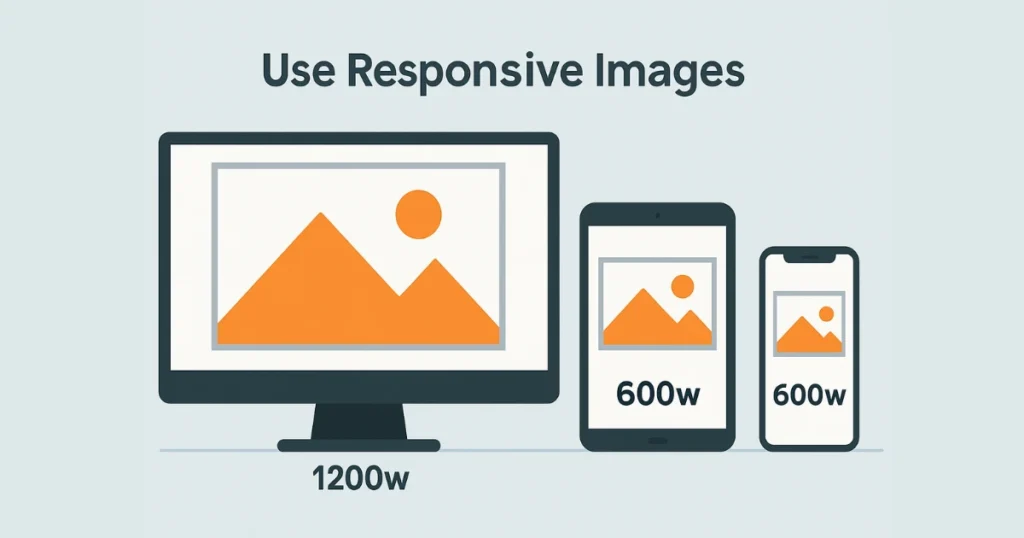
4. Use Responsive Images for Different Devices
Today’s web is multi-device – from high-DPI mobile screens to large desktop monitors. A one-size (or one-resolution) image does not fit all. Responsive images allow your website to serve an appropriately sized image to each device or screen scenario, rather than always the largest version. This ensures mobile users aren’t forced to download huge desktop-sized images, for example.
HTML provides tools like the srcset attribute and <picture> element to implement responsive images. In essence, you can provide multiple versions of an image at different widths or pixel densities, and the browser will automatically choose the best one for the user’s device. For instance, you might supply a 400px wide image for small screens, an 800px for medium, and 1200px for large – and the browser picks the right file. This way, each user gets a file just big enough for their viewport, no larger.
Using responsive images can significantly improve performance. You’re only delivering what’s necessary for that device’s screen, saving bandwidth on smaller devices. As a bonus, images look sharper on high-density (Retina) displays when you provide 2x versions for those devices. For example, if an image slot is 300×300 CSS pixels, you can provide a 600×600 image for devices with 2x pixel density, so it looks crisp on those screens. The browser will swap in the higher-res image only for those who need it.
Implementing this typically involves:
- Adding a srcset to your <img> tag listing the image file URLs and their widths (or pixel densities). For example: <img src=”image-800.jpg” srcset=”image-400.jpg 400w, image-800.jpg 800w, image-1200.jpg 1200w” sizes=”(max-width: 600px) 400px, 800px”>. This tells the browser about the 400w, 800w, 1200w versions and when to use them.
- Using the <picture> element if you need to serve entirely different images for different scenarios (like a different crop for mobile vs desktop). <picture> allows art direction based on media queries.
- Ensuring your site’s HTML includes the proper sizes attribute or CSS so the browser knows how large the image will be displayed (to choose the best srcset candidate and also avoid layout shifts).
According to modern performance guides, implementing srcset and picture is a best practice to serve different image sizes based on the user’s screen. In simpler terms: responsive images = optimal images per device. This reduces load times on small devices (no need to pull down a giant image for a tiny screen) and maintains visual quality on big or high-res devices (by sending a sharper image when needed). It’s a win-win for UX and performance.
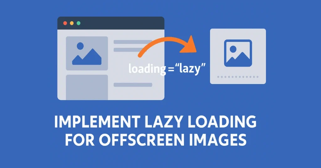
5. Implement Lazy Loading for Offscreen Images
Not all images need to load immediately, especially those that aren’t visible when the page first renders (for example, images further down the page that require scrolling to see). Lazy loading defers the loading of images that are offscreen, loading them only when (or just before) they enter the viewport. By lazy-loading non-critical images, the initial page load is faster and uses less data, improving the user experience for what they see first.
In practical terms, enabling lazy loading means the browser won’t download images until they are needed. This reduces the number of requests and bytes during the initial page load. The result is a quicker time to first contentful paint and a faster interactive page, since images below the fold aren’t blocking anything. Users who never scroll down won’t download those images at all, saving bandwidth.
The easiest way to implement this is by using the standard HTML attribute loading=”lazy” on your <img> tags. Modern browsers recognize this attribute and will automatically defer those images. For example: <img src=”photo.jpg” alt=”…” loading=”lazy”>. With this, images will lazy-load without any custom JavaScript. It’s essentially a hint to the browser to delay loading until necessary. As noted in performance checklists, using loading=”lazy” on below-the-fold images delays loading non-critical images until they are needed, improving page speed.
A few tips for lazy loading:
- Prioritize above-the-fold images: You should not lazy-load images that appear at the top of the page (like your logo or hero banner). Those should load normally so the user sees them ASAP. Only apply lazy loading to images that start off-screen.
- Use modern browser support: The native lazy loading attribute has wide support in current browsers. If you need to support very old browsers, there are JavaScript polyfills, but for most cases loading=”lazy” is sufficient.
- Avoid layout shifts: When lazy-loading, be sure to set width and height (or CSS aspect-ratio) on your <img> elements. This reserves space for the image, so that when it loads later it doesn’t push content around (preventing layout jank). This addresses potential Cumulative Layout Shift issues.
By implementing lazy loading, you can often make the initial page load much faster – especially on image-heavy pages or long one-page sites. Users will appreciate that the content they care about (at page load) appears quickly, and as they scroll, images seamlessly load in. It’s an easy win for performance and perceived speed.

6. Utilize Modern Image Formats (WebP and AVIF)
While choosing the right traditional format (JPEG vs PNG) is important, you can often get even better results by adopting newer, more efficient image formats. WebP and AVIF are two modern formats that offer superior compression, meaning you get the same image quality for a much smaller file size compared to older formats.
- WebP: Developed by Google, WebP can use both lossy and lossless compression. In many cases, converting a JPEG to WebP can reduce file size by 25-30% or more for the same quality. Compared to PNG, WebP can produce dramatically smaller files, especially for photos or complex graphics. Most modern browsers (Chrome, Firefox, Edge, Safari 14+) support WebP, making it a safe choice to use for a broad audience.
- AVIF: A more recent format derived from the AV1 video codec. AVIF offers even better compression than WebP, often 50% smaller than an equivalent JPEG for similar quality. It supports high dynamic range (HDR) and transparency. The downside is that browser support, while improving, might not be 100% yet (as of 2025, support is common in Chrome, Firefox, and Safari likely has or will have it soon). Still, AVIF is poised to be a game-changer for image optimization due to its tiny file sizes.
By using these next-gen formats, you can significantly speed up image loading. For example, if you have a hero image that is 1 MB as a JPEG, converting it to AVIF might shrink it to a few hundred KB with no visible loss – that’s a big reduction in load time.
How to use WebP/AVIF on your site: You can convert your images to WebP or AVIF using various tools (command-line converters, online tools, or even built-in export options in some software). Many content delivery networks and image optimization services can automatically serve WebP/AVIF to supported browsers while falling back to JPEG/PNG for others. A common approach is:
- Continue to store images in a traditional format (JPEG/PNG) as a fallback.
- Use a tool or script to generate WebP/AVIF versions of each image.
- On your site, use the <picture> element or server-side content negotiation to serve the modern format if the browser accepts it. For instance, <picture><source srcset=”image.avif” type=”image/avif”><source srcset=”image.webp” type=”image/webp”><img src=”image.jpg” alt=”…”></picture> ensures the browser will use AVIF if possible, otherwise WebP, otherwise default to JPG.
This way, you get the benefits of newer formats without locking out any users on older browsers. Many site platforms and CDNs can handle this complexity for you, automatically converting and delivering the best format per user agent (for example, you upload JPEG/PNG and the service outputs WebP/AVIF to users).
Modern image codecs can drastically reduce image file sizes. Whenever feasible, incorporate WebP and AVIF into your image strategy. It’s one of the quickest ways to shave off kilobytes (or even megabytes) from page load, directly translating to faster load times and happier visitors.
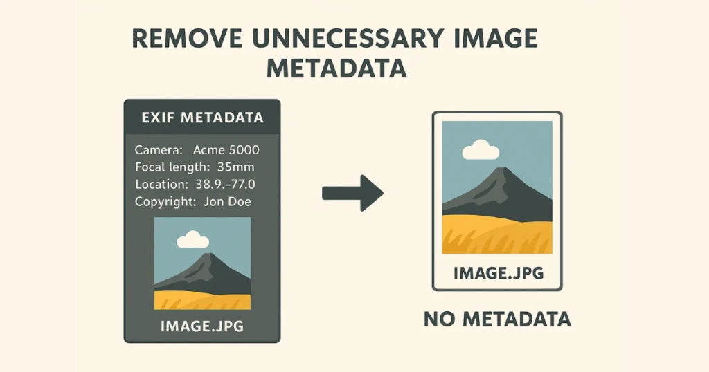
7. Remove Unnecessary Image Metadata
Image files often contain more than just the visual data. Photographs, in particular, may carry EXIF metadata – information like camera model, settings, date, location, as well as thumbnail previews and editing history. While this data can be useful for photographers, it’s not needed on a web image that’s being served to users. Stripping out metadata can shave off additional bytes from your images.
For example, a JPEG straight from a camera might have dozens of kilobytes of metadata about the lens, ISO, geolocation coordinates, etc. Removing that won’t affect how the image looks at all; it only removes the hidden textual data. For web use, it’s generally safe to remove all metadata (except perhaps color profile info if needed, though usually not).
Many optimization tools will do this automatically. When you use things like Photoshop’s “Save for Web” feature or online compressors, they often remove unnecessary metadata from your image files as part of the process. If you’re using a script (like ImageMagick or image optimization libraries), make sure to enable options to strip metadata. The result is a leaner file containing just the image pixels.
Why bother? It’s part of squeezing out every unneeded byte. On a single image, metadata removal might save only a few KB, but across an entire site’s images it adds up. And on low-bandwidth connections, every kilobyte matters. Also, for privacy reasons, you likely don’t want to inadvertently expose details like where a photo was taken or personal data via EXIF.
In summary, clean your images of extra data. You can think of it like decluttering your luggage before a trip – the lighter, the better for speed. By ensuring only essential image data is kept, you make your image files as light as possible. This contributes to faster downloads and a more efficient website. It’s an invisible optimization that users won’t see, but they’ll feel it in faster page loads.

8. Use Vector Images (SVG) for Icons and Simple Graphics
Not every image has to be a bitmap (made of pixels). For many simple graphics like logos, icons, or illustrations with flat colors and shapes, vector formats can be superior. The most common vector image format for the web is SVG (Scalable Vector Graphics). Using SVGs where appropriate can both improve load time and ensure your graphics look sharp on all screens.
Advantages of SVG for simple graphics:
- Tiny file sizes: SVG graphics are defined in XML text. For simple images (think a logo made of some shapes and text), the file size is often much smaller than an equivalent PNG or JPEG. There’s no pixel data for each pixel – just instructions like “draw a circle of X radius at Y position”. This can be extremely efficient. For example, an SVG icon might be only a few hundred bytes or a couple KB, whereas a PNG of the same icon could be 5–10 KB or more.
- Scalability and resolution independence: As the name “Scalable Vector Graphics” implies, SVG images can scale to any size without losing clarity. There’s no fixed pixel grid. This means your icons will always render in the highest possible quality on any device, from low-res to Retina displays, with no extra effort. You don’t need separate @2x versions for high DPI – the same SVG covers all.
- Styling and interactivity: SVGs can be manipulated with CSS or JavaScript (you can change colors on hover, animate parts of the SVG, etc.). This is a bonus for UX, though not directly about load time.
By using SVGs for logos, icons, and illustrations, you reduce the number of raster images that need heavy bytes. It’s noted that for simple illustrations, vectors tend to be very efficient, enabling even large visual elements to have minimal file size. Many modern websites use SVGs for their entire icon sets and graphics. You might have noticed that company logos often are SVGs, ensuring they look crisp on all devices and load quickly.
To implement this, export your flat graphics from design software as SVG instead of PNG. Make sure to optimize the SVG code (there are tools like SVGO that can reduce SVG file size by removing unnecessary code/comments). Then embed the SVG in your site either as an <img> src or inline in the HTML for even more control.
Keep in mind SVG is best for flat art – it’s not suitable for photographs or very complex, detailed artwork (those are best left as bitmaps). But for the right use cases, switching to vector graphics will give you smaller files, faster loads, and perfectly sharp visuals at any size. It’s a smart optimization that enhances both performance and visual quality.
9. Inline Small Images or Combine Icons into Sprites
Every time your webpage needs to fetch an image file, it incurs a little overhead (an HTTP request). Even if an image is small, making a separate request for dozens of small images (like icons, buttons, etc.) can add up in latency. To streamline this, you can reduce the number of separate image requests by inlining or combining images:
- Inline images as Data URIs: This technique embeds the image data directly into the HTML or CSS as a Base64 string. For very small images (a few KB or less, such as a tiny icon or a background pattern), you can take the image file’s content and put it right into your CSS or HTML. The browser then doesn’t need a separate request – it gets the image from the page code itself. This is often done for critical icons or logos. For example, you can have a CSS like: background-image: url(“data:image/png;base64,iVBORw0KG…”). Since the image is now part of the initial HTML/CSS, it loads with the page without another round-trip. Tools can convert images to these data URIs easily.
- Sprite sheets: This old-school technique combines multiple icons or small graphics into one larger image file (a sprite sheet). Then you use CSS to display a specific portion of the sheet for each icon. The classic example is merging all your button icons into one PNG and using background-position to show the correct section. This way, the browser makes one request for the sprite image instead of many requests for each icon. With HTTP/2+ this is less crucial than it once was, but it can still help in some cases by consolidating requests.
The general idea was highlighted in performance guides as embedding critical images like icons or logos to eliminate extra network requests. By doing so, you can reduce the overhead of multiple connections. If each request has, say, 50ms of latency, combining 10 small images into 1 could save roughly 9×50ms = 450ms in worst-case scenarios (though HTTP/2 does multiplex requests, it still has some overhead per request).
Use these techniques judiciously:
- Inlining is best for very small images (think icons, or a small logo). Don’t inline large images (it will bloat your HTML).
- Sprites are useful if you have many icons and you’re not using SVG or icon fonts. However, managing sprite coordinates can be tedious; many modern dev workflows use SVG icons or icon fonts instead to similar effect (single file or few files).
- Another option: inline SVGs. If your icons are SVG, you can directly include the SVG code in HTML (or an <svg> sprite). This avoids separate requests and keeps things lean.
By reducing the number of separate image files the browser must fetch, you can improve overall load time and minimize round-trip delays. The user’s browser can get necessary graphics as part of initial payloads. This makes the page appear more quickly fully rendered and interactive, contributing positively to UX.

10. Leverage Browser Caching for Images
Once you’ve optimized and delivered your images, you should also ensure the browser can cache them for subsequent page loads. Browser caching means that when a user visits another page on your site (or comes back later), the images don’t need to be downloaded again if they haven’t changed. This can make return visits or multi-page navigation almost instant for image loading, greatly improving UX.
To enable caching, you need to configure proper HTTP headers on your images (this is usually done on the server or via your CDN). The key header is Cache-Control (or the older Expires header). By setting a long max-age (for example, a year in the future) and a public cache setting for your image resources, you tell browsers “you can keep this file and reuse it for future requests.” For images that rarely change (like logos or icons), you can safely set a long expiry. If you ever need to update them, you can change the filename or query string to bust the cache.
For instance, a response header might be:
Cache-Control: public, max-age=31536000
This signals the image can be cached by the browser (and intermediate caches) for up to one year.
With caching in place, the first time a user visits your site they download the images, but on subsequent pages those images load from the local cache (which is effectively instantaneous and zero bytes over the network). This reduces load times dramatically for repeat views. It’s especially important on websites where users navigate across multiple pages (like an e-commerce store or blog) – you don’t want to re-download the site logo, product photos, etc. every single page view.
Performance checklists often include this under “serve images with proper caching headers”. Additionally, ensure that your server or CDN uses efficient protocols (HTTP/2 or HTTP/3) for delivering images, as they handle multiple requests faster. But caching is a big part of that efficiency.
Tip: Combining caching with a versioning strategy (like adding a version number or hash to your image filenames) allows you to set long caches without worrying about updates. If you change the image, you change the URL which forces browsers to fetch the new one. If not, they keep using the cached copy.
In summary, make sure to tell browsers to cache your images. It’s a one-time cost for the user to get the image, and then it’s free on subsequent loads. This enhances user experience by making page transitions and return visits much faster and lighter on data usage. It’s a simple configuration that yields faster load times and happier visitors.

11. Use a Content Delivery Network (CDN) for Faster Delivery
A Content Delivery Network (CDN) can turbocharge the delivery of your images to users around the world. Instead of all users fetching images from your single web server (which might be located far away from some users), a CDN serves images from a network of servers distributed globally, choosing the one closest to each user. The shorter the distance and hops the data travels, the faster the image reaches the user’s browser.
When you use a CDN, your image URLs are typically mapped to the CDN’s domain, and the CDN takes care of caching those images on edge servers worldwide. So a user in London might load your images from a UK server, while a user in New York loads from a U.S. server. This geo-distribution reduces latency. As one guide explains, a CDN reduces the distance data needs to travel and can greatly improve website speed.
Benefits of using a CDN for images:
- Lower latency: Physical distance and network congestion are reduced, so time-to-first-byte for an image is quicker.
- Higher throughput: CDNs are optimized for static content delivery and often have fat pipes and caching, meaning they can serve images very quickly to many users at once. Your own server offloads that work.
- Reliability: If one server is busy, CDNs usually route to another. They’re built for uptime and can handle spikes in traffic better than a single origin server.
- Advanced optimizations: Many CDNs offer image-specific optimizations – for example, on-the-fly compression, automatic WebP conversion for supported browsers, resizing images to various dimensions, etc. This can integrate well with the other tips we’ve covered (some CDNs will do responsive image generation, format conversion, and compression for you based on request parameters).
To implement a CDN, you would sign up with a provider, configure your domain’s images to be served through it (often as simple as changing image URLs to use the CDN link or via a DNS change), and ensure your origin is feeding the CDN. After that, the first request for an image in a region might be a tad slower (cache miss to fetch from origin), but subsequent requests in that region will be served from the edge cache at blazing speed.
Using a CDN goes hand-in-hand with the caching tip above – CDNs cache images on edge servers, and they also should serve them with optimal protocols (HTTP/2, HTTP/3) and compression. In effect, a CDN efficiently caches and hosts your images so that users get them quickly. This is especially crucial if your site caters to a global audience; everyone gets a more local experience.
All in all, serving images via a CDN can significantly enhance load times and thus UX. It’s a bit of an architectural choice beyond just image tweaking, but it’s one of the most powerful optimizations for delivering a fast experience. Many top-performing sites leverage CDNs for their static assets, including images, to ensure speed and consistency for users everywhere.

12. Optimize Alt Text and File Names for SEO & Accessibility
Our final tip isn’t about file size or speed, but it’s an important aspect of image optimization for a better UX and SEO performance. Ensuring your images have descriptive file names and alt text attributes will not make them load faster, but it will make your site more accessible and can boost your search engine rankings and traffic.
Descriptive file names: Instead of a generic name like IMG_1234.jpg, rename your image to something meaningful like red-running-shoes.jpg (briefly describing the content). Search engines crawl file names, and a descriptive name gives context about the image. It might help the image appear in image search results for relevant queries. It’s a minor ranking factor, but every bit helps.
Alt text (alternative text): This is the text that describes the image, primarily used by screen readers for visually impaired users (and shown if the image fails to load). Writing a clear, concise alt text for each image improves accessibility – for example, alt=”Red running shoes on a white background” for the above image. From an SEO perspective, alt text also adds value to your website by associating keywords with your images, helping them rank better in Google’s image search. In fact, for e-commerce, descriptive alt tags are crucial for products to show up in search results.
Here’s why this matters for UX and SEO:
- Visually impaired users or those using screen readers will have a much better experience on your site if images are properly described. This is part of good UX – making content accessible to all.
- Search engines use alt text to understand the image content. Optimized alt text can improve your overall page relevance. For instance, if someone searches for “red running shoes”, an image with that alt text might surface in Google Images, leading users to your site. Optimized images can thus drive organic traffic to your site.
- If an image doesn’t load (due to a network issue), the alt text appears, ensuring the user still knows what was intended to be there.
To optimize, follow best practices: keep alt text brief but descriptive, include a relevant keyword if it makes sense (don’t stuff keywords), and don’t bother with alt text for purely decorative images (use empty alt for those). Also, ensure your surrounding content or captions (if any) are relevant to the image.
While these steps don’t impact load time, they enhance the overall user experience and are considered part of image optimization in a broader sense. They tie your images into your site’s content effectively. Remember, a fast site that also provides useful content to search engines and all users (including those with disabilities) will rank and perform better. Optimized alt text and file names contribute to a more authoritative, searchable, and user-friendly website.
Does Image Optimization Improve Website Rankings?
Yes—image optimization directly impacts both page speed and user experience, two key factors in modern SEO. Google’s Core Web Vitals (like Largest Contentful Paint and Cumulative Layout Shift) measure load performance and stability, and images often account for up to 50% of page weight.
By reducing file size, using responsive images, and implementing lazy loading, you improve page load time, decrease bounce rates, and send positive engagement signals to search engines. Faster, more accessible pages tend to rank higher in both desktop and mobile search results, making image optimization a vital component of your overall SEO strategy.
How Can I Ensure My Images Are SEO-Friendly?
To make your images work for both users and search engines, apply these SEO-friendly practices:
- Descriptive File Names & Alt Text
• Rename files with relevant keywords (e.g. vintage-leather-jacket.jpg).
• Use concise alt text (max ~125 characters) that describes the image function or content for accessibility and image search ranking. - Image Sitemaps
• Include a dedicated <image:image> entry in your XML sitemap so search engines discover all visual assets, boosting crawl coverage and indexation. - Structured Data for Images
• Implement schema markup (e.g. ImageObject) to give search engines explicit context about your images, increasing chances of rich results. - Responsive & Mobile-Friendly Images
• Use srcset and <picture> to serve the optimal image size per device, enhancing mobile UX and Core Web Vitals. - Compression & Caching
• Compress images (lossy or lossless) before upload and leverage long-term Cache-Control headers so returning visitors load images instantly from cache.
What is the best picture format for the web?
The best picture format for the website is:
- JPEG for photographs (lossy, small file sizes).
- PNG for flat graphics or transparency (lossless).
- WebP/AVIF for next-gen compression—often 25–50% smaller than JPEG with equal quality.
Choose based on content: use JPEG or WebP for photos, PNG/SVG for logos, and AVIF when browser support allows.
What is the optimal resolution for website images?
The optimal resolution for website images is:
- 72 PPI as a baseline for web display.
- Match the image’s pixel dimensions to its CSS display size (e.g. 800×600 px if shown at that size).
- For high-DPI (Retina) screens, supply 2× or 3× versions (via srcset) to ensure crispness without overserving large files to standard screens.
How do I make an image file size smaller?
To make an image file size smaller, follow these:
- Resize to display dimensions.
- Compress images with tools that balance quality vs file size (e.g. 80% JPEG quality).
- Strip metadata (EXIF) to remove unused camera data.
- Convert to next-gen formats (WebP/AVIF) for maximal compression.
What are some free photo optimization tools available?
Some free photo optimization tools are:
- TinyPNG / TinyJPG – Smart lossy compression for PNG and JPEG.
- Squoosh – Open-source, in-browser compressor supporting multiple formats.
- ImageOptim – macOS app for lossless compression and metadata stripping.
- Compressor.io – Batch compress JPEG, PNG, GIF, and SVG.
- Kraken.io (Free Plan) – Online lossy and lossless options with API access.
Is image optimization part of Technical SEO or On-Page SEO?
Image optimization falls into both parts.
- Technical SEO: Deals with file formats, compression, lazy loading, CDNs, caching, and Core Web Vitals—ensuring your site infrastructure serves images efficiently.
- On-Page SEO: Focuses on descriptive file names, alt text, structured data, and image sitemaps—ensuring each image contributes semantic relevance and accessibility to your content.
By treating image optimization as a dual discipline, you’ll improve site performance and search visibility in tandem.
Tusar Ahmed is the Founder and Senior SEO Specialist at Inflowen. With over seven years of hands-on experience in SEO, local search optimisation, and keyword strategy, he simplifies complex digital concepts into engaging, actionable insights.
Tusar has worked on 250+ projects across the UK and beyond, helping businesses of all sizes improve their search visibility and achieve measurable growth. His writing blends technical expertise with a clear, approachable tone—making SEO feel both accessible and results-driven.
Follow his content for a fresh, practical perspective on ranking better, reaching the right audience, and staying ahead in the ever-evolving digital landscape.